Visual notetaking allows the learner to combine text and visuals to create an easy to follow format. Canva, a free, online graphic design can help you create beautiful digital notes or diginotes. Here are 10 tips for getting started with Canva.
I’m pretty sure I am addicted to Canva, the graphic-design tool website. Canva, which uses a drag-and-drop format allows non-designers to create a variety of graphic designs with ease. Seriously though, anytime someone says they need a poster, marketing tool, social media graphic, I’m drooling at the thought of creating my next design.
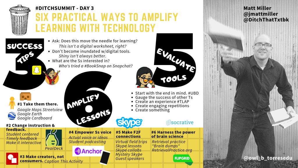
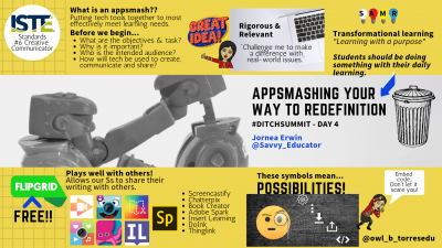
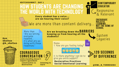
A while back I figured out another great use for Canva…creating digital notes or #diginotes for short. Visual learners who struggle to sketch, such as myself, find that creating notes using a variety of graphics, fonts, and bulleted points is not only fun but allows me to quickly share my learning with others.
So what is a diginote?
Similar to a sketchnote, this form of notetaking allows the learner to combine both visuals and words in a way that encourages a mapping of ideas in an easy to follow format.

Want to try creating your own? Below you’ll find ten tips to help you get started creating your own awesome #diginotes using Canva.
1. Use the templates that Canva provides. Depending on the project that you are creating there is a multitude of options. When creating #diginotes I use the presentation templates to get started.
2. Fill in as much information as possible ahead of time. For example, the name of the session/webinar, the presenter, and their social media contact information can all be prepopulated to save time and allow you to focus during the learning event.
3. In addition to using the Canva icons, I also use Pixabay to ensure that I have a variety of icons to choose from. Canva offers a lot of different icons to use; however, there is a charge for some of them.
 4. Bitmojis are a great visual to add to your #diginotes. It makes the notes personal, fun, and can add emotion to your notes!
5. Sometimes a real photo can go much farther to impress the eye than an icon. For my real photos, again I use images available through Canva or download images from Unsplash, a site sharing free stock photography.
6. The size of an image or words conveys importance. Try to keep all of your icons as similar in size as possible, unless you are trying to draw attention to a specific area or note.
7. Use the “copy” function to easily duplicate text repeatedly. I use this feature to ensure that fonts, sizes, and color of the text are automatic and do not have to be reset each time I add text.
 8. Be concise with your words. If you are listing items or a series of thoughts use bullets to allow the reader to process through the separate ideas easily. Keep your #diginotes to one page if possible.
9. Don’t be afraid to leave open space on your notes. You want to be able to appeal to the eye of the reader. Overcrowding makes it difficult to think about the content being shared.
10. Finally, when you’re done download your final product at a JPEG or PNG to easily share on social media sites or to embed within presentations. Be sure to label your notes so that others can give you credit when they share!
Need even more tips and how-tos for using Canva? Try out their free Design School lessons available through your Canva account.
For notifications of new Ditch That Textbook content and helpful links:
- like Ditch That Textbook on Facebook
- follow @jmattmiller on Twitter
- check out the #DitchBook community on Twitter
- follow Ditch That Textbook on Pinterest
- subscribe to the Ditch That Textbook YouTube channel!
Interested in having Matt present at your event or school? Contact him by e-mail!
Matt is scheduled to present at the following upcoming events:
[getnoticed-event-table scope=”upcoming” max=”15″ expanding=”false”]


[…] Resource: 10 tips for creating awesome diginotes with Canva (these tips apply to digital note taking with Google Slides and Powerpoint too!) […]