Creating stop-motion animation with Google Slides is easy! These tips will help your animations look phenomenal!
This post is written by Jake Miller, a tech integration specialist from Ohio. He's a Google for Education Trainer and a self-proclaimed spreadsheet nerd. Find him on Twitter (@JakeMillerTech) and at his blog, jakemiller.net.
A note from Matt ...
I wrote a post recently about using Google Slides for stop-motion animation. When Jake Miller wrote this post about 11 tips for creating Google Slides stop-motion animation, I knew I had to share them with you!
Jake is constantly blogging about the meaningful use of technology on his blog, jakemiller.net. If you like what you find on Ditch That Textbook, his posts will be a great fit for you, too! Be sure to sign up for Jake's email newsletters, which are packed full of great ideas to use in the classroom!
Jake is also a WIZARD at creating animated GIF images to illustrate his tips! Check out the images he shares on the #EduGIF Twitter hashtag or in this Google Drive folder. There are a LOT!
Now, for Jake's 11 tips for creating stop-motion animation with Google Slides!
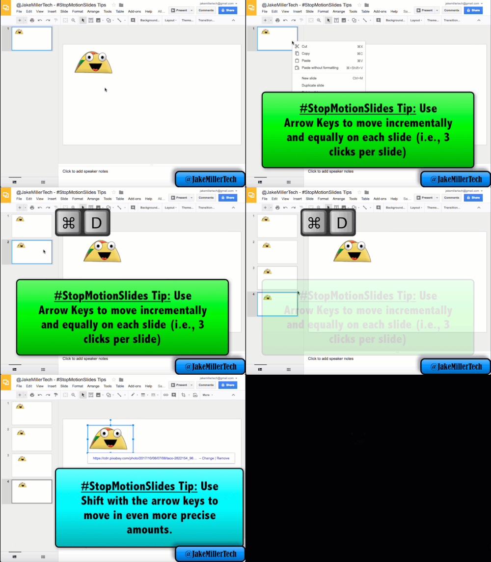
2. Use arrow keys to move
If you want objects in your animation to appear to be moving, you’ve got to make sure they’re moving in small, constant amounts between slides. The best way to do this is to use your arrow keys. I like to move things about 2-4 clicks per slide, depending on how fast I want them to be moving and how far they’ll be traveling. If things need to move diagonally, move a combination of the left/right and up/down arrow keys (i.e., 2 right, 3 down). One final tip – if you need really precise movements, using the shift key with the arrow key leads to even smaller movements – one pixel at a time.
3. Pay attention to degrees when rotating objects
Much like when moving objects, you want to make sure that you rotate objects in relatively small, constant amounts. One option for doing this is to just pay attention to the degrees you see when rotating – i.e., 5°, 10°, 15°, etc. It’s tricky to get this just right, but anything close to constant (i.e., 5.1°, 9.8°, 15.2°, etc.) should do. A second option is the Rotate 1° keyboard shortcut. Use Alt (option on a Mac) + Shift + Left or Right arrow to do this. A third option is the Rotate 15° keyboard shortcut. Use Alt (option on a Mac) + Left or Right arrow to do this. I lean towards using the second option with a few clicks (3-5) for each slide, but it’s best to pick based on your situation/goal. A fourth option which isn’t shown in this GIF below is to hold down Shift while rotating with your mouse – this locks your rotation into increments of 15°.
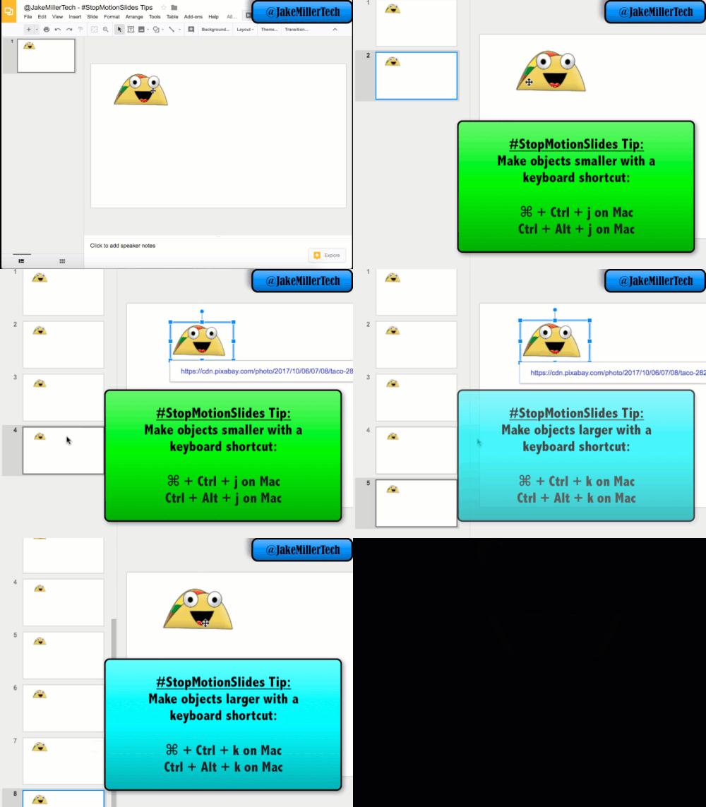
4. Use keyboard shortcuts to resize
There’s a pattern here, friends. If you want this to look like a legit animation, you’ve gotta do everything incrementally and at a constant rate. Keyboard shortcuts always help with that. There are a few shortcuts for resizing – the most important are Ctrl + Alt + j (⌘ + Ctrl + j on Mac) for smaller and Ctrl + Alt + k (⌘ + Ctrl + k on Mac) for larger. Both of these resize proportionally (width & height) and from the center. They’re not shown in the GIF below, but you can also resize vertically (Ctrl + Alt/⌘ + i or q) or horizontally (Ctrl + Alt/⌘ + b or w). One final trick here – you may have noticed that if you just drag the “resize grabber” in the corner it resizes proportionally, but not from the center. If you hold down Control (Option on Mac), it’ll do it from the center.
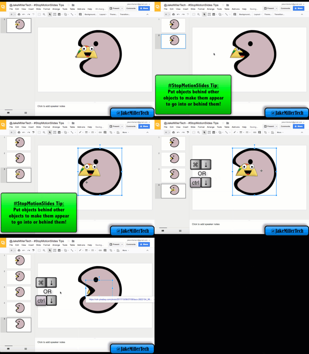
5. Move objects forward or backward
If you’re creating a good animation, you’re going to need consider which objects should be on the top “layer.” Sometimes you even need it to look like something is going inside something else. You can use bring forward (⌘/Ctrl + up ), send backward (⌘/Ctrl + down), send to the back (⌘/Ctrl + Shift + down) and bring to the front (⌘/Ctrl + Shift + up) to do this. The difference in forward/to the front and backward/to the back is whether you want it to go up/down one layer or all the way to the “back” or “front.” You can either use the right-click menu or the keyboard shortcuts.
7. Use the slide edges strategically
Sometimes your characters or objects need to enter or exit the “screen” from one of the sides – not just appear or disappear. In that case, you should use the screen edges strategically. Anything that is off the edge of the slide won’t be visible when you’re in present mode – and this is great news, because you can use it to good effect. Check it out in the GIF below:
8. USE KEYBOARD SHORTCUTS TO SELECT ITEMS TO MOVE/MODIFY
This may seem like an unnecessary tip, but if you’re doing an animation where you have multiple objects moving in different directions or at different rates, or an even wider array of things happening, it may save you some seconds to use keyboard shortcuts to select objects. The Tab key toggles which object in the slide is selected. It goes in the order that they were originally added there. Using Shift+Tab will go through the objects in reverse order.
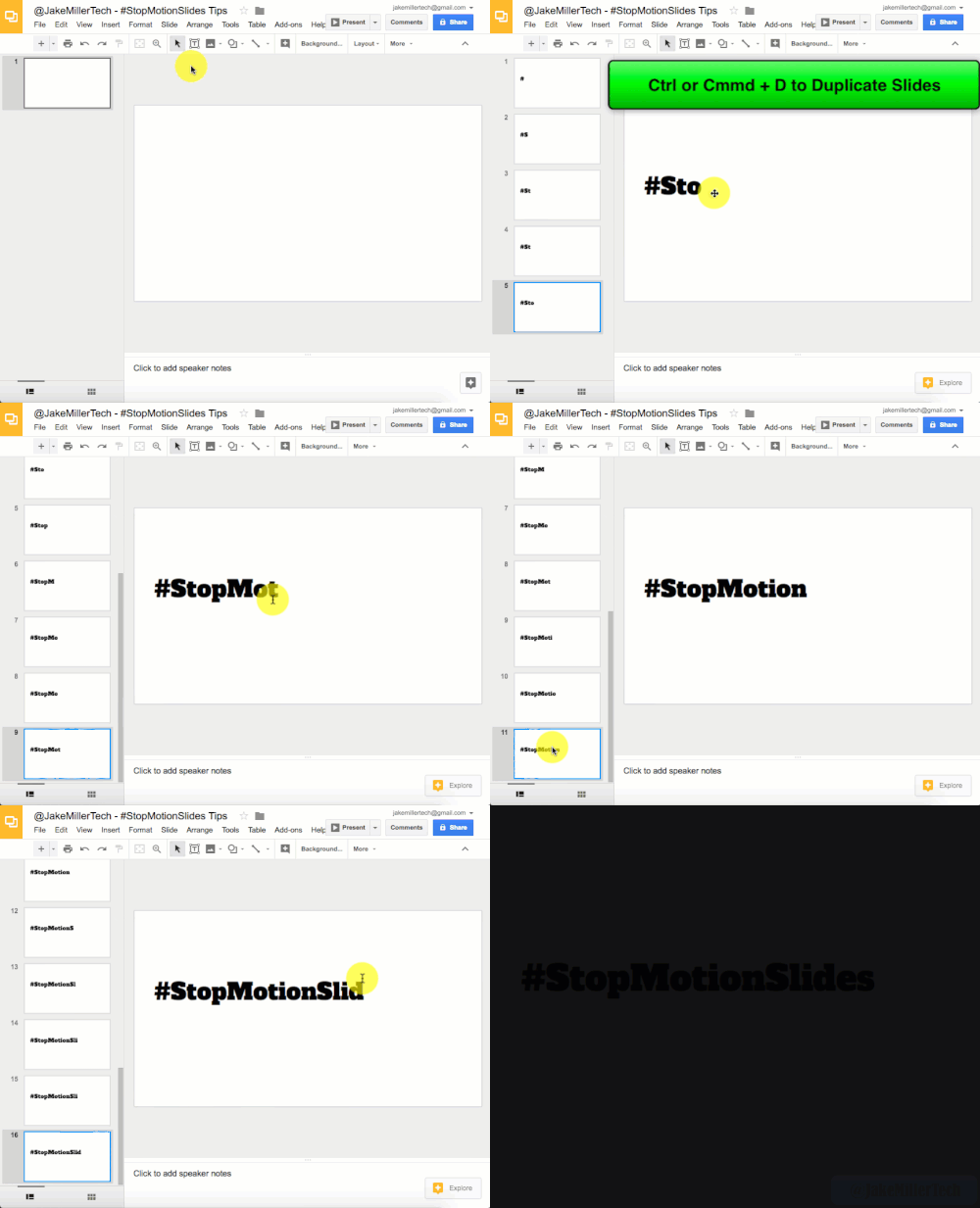
9. Make text appear from one letter at a time
Listen, I know the old transition in PowerPoint and other programs with the typewriter text (where it appeared one letter at a time) was torture to watch, but in a Stop-Motion Animation, having a word fade in from left to right can be useful. This one is super self-explanatory – start with one letter on the first slide in the series and add the letters one at a time until the entire word (or phrase) is showing. That’s it! As if you needed it, here’s a GIF to make it crystal clear. 🙂
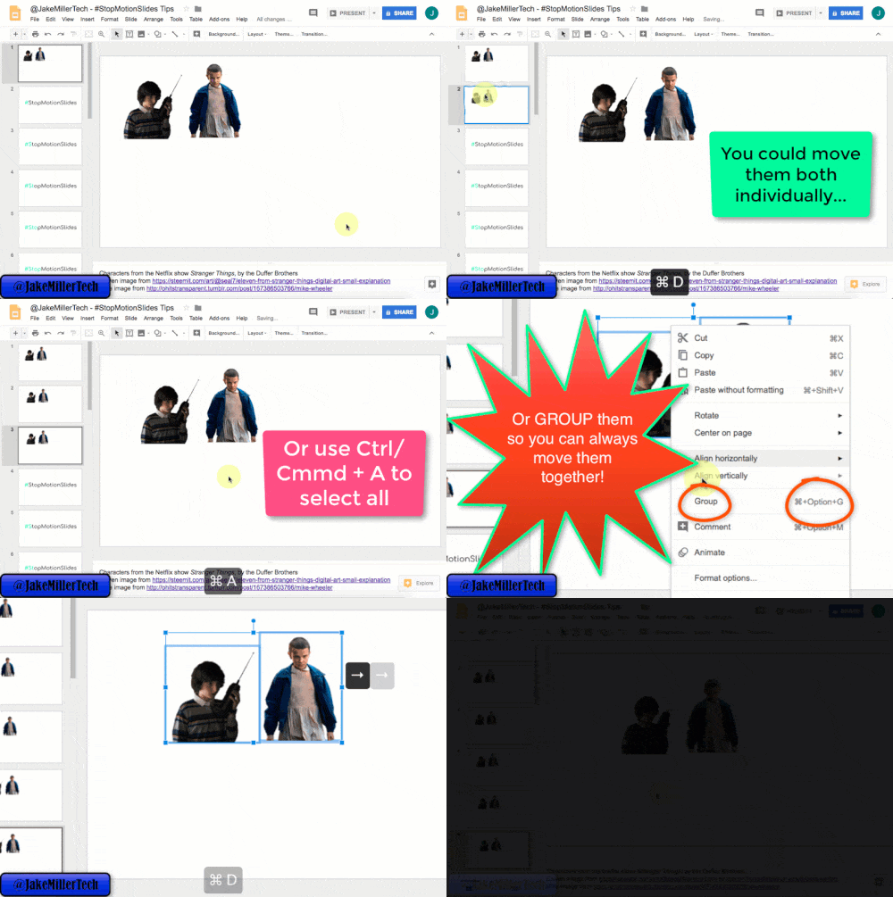
11. Move objects together
If you’ve got multiple objects that you are moving the same distance on each slide, save yourself some seconds and move them together! There are a few ways to do it, but if you’re moving them on multiple slides, I recommend that you Group (⌘/Ctrl + Option/Alt +G) them – they’ll stay grouped on each slide when you duplicate, making it super easy to move them each time. An additional tip – if you have 1 object that you’re moving, say, five arrow clicks and another that you’re moving, say, three arrow clicks – use your mouse to select them both to move 3 spaces, and then move the one its additional 2 spaces.

Looking for FREE Tech Like A PIRATE resources?
You’ll find a treasure trove of additional ideas and activities related to the book at TechLikeAPirate.com!
For notifications of new Ditch That Textbook content and helpful links:
Are you looking for quality, meaningful professional learning that both equips and inspires teachers?
Matt provides in-person and virtual keynotes, workshops and breakout sessions that equip, inspire and encourage teachers to create change in their classrooms. Teachers leave with loads of resources. They participate. They laugh. They see tech use and teaching in a new light. Click the link below to contact us and learn how you can bring Matt to your school or district!
Is Matt presenting near you soon? Check out his upcoming live events!








Great article, but I’m having a problem with a .png cutout of a bird flying across the screen. When the bird appears on the left in the presentation, it is nearly transparent. It is fully visible by the time it reaches the right side of the screen. I have the animation set to in from left. When the bird first appears, you can almost see through it, although I have no “fade” set. Can you help?
[…] https://ditchthattextbook.com/11-tips-for-creating-stop-motion-in-google-slides/ (različne vrste animiranja – premikanja, postopnega prikazovanja) […]
[…] https://ditchthattextbook.com/11-tips-for-creating-stop-motion-in-google-slides/ (različne vrste animiranja – premikanja, postopnega prikazovanja) […]
Amazing tips!! Thanks so much!!
[…] MORE: 11 tips for stop-motion animation […]