Infographics are visually stimulating and force us to summarize well. These brain-friendly student creations can be a great change of pace for essays and research papers.
Infographics are everywhere. I first started noticing them on the front page of USA Today as a journalism major in college. As Pinterest became more popular, the long, tall infographics have begun popping up everywhere.
I’m a huge fan of infographics. They let students create a great verbal/visual mix with the content they’ve learned. They summarize information succinctly. Plus, they're easy to share.
Have you ever looked at those fancy, expertly-designed infographics and thought, "I could never do that, and my students definitely could never do that"?
Today's your lucky day. Infographics aren't that hard to create. Plus, if your students have a template to get them started, they can create infographics in no time at all.
Here's what you'll find in this post. Click one of the links below to jump straight to that section. Plus, I'll include some example infographics in each one!

Why infographics are a great learning activity
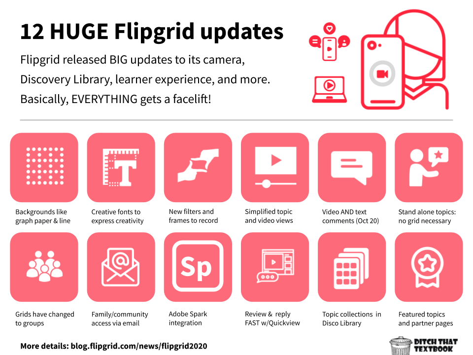
Example infographic above: Summarizing updates to Flipgrid with bold colors
We don't want students to create infographics just because they're fun or different. We want them to learn! Infographics are a great academic task for lots of reasons ...

Reason 1:Our brains love images and text together.
When we learn with a blend of images and text, we're more likely to be able to retrieve that learning from our brains later, according to dual coding theory. Our brains encode images differently in our long-term memory than than we encode text. Because it's encoding it in two different ways, we have a better chance of being able to retrieve that learning later.

Reason 2: Students create to make meaning.
When students make infographics, they're creating. They're making something to make sense of the world. This is the basis of “constructionism,” a term coined by Seymour Papert. Students are creating mental models to understand the world around them. In fact, the more constructing they do on their own (and the less “follow the recipe” approach), the better.

Reason 3: Brevity and summarizing force us to think.
When I wrote research papers in high school and college, here was my goal: get to the word limit. When I was done writing three pages, 3,000 words, or meeting any other requirement, I could stop. Instead of trying to pick the best facts, details, and words, I was just cramming in words so I could be done.
Let's flip that script. Infographics make students summarize. They have to be brief. When we have limited words, we choose them very carefully.

Tools you can use to make infographics
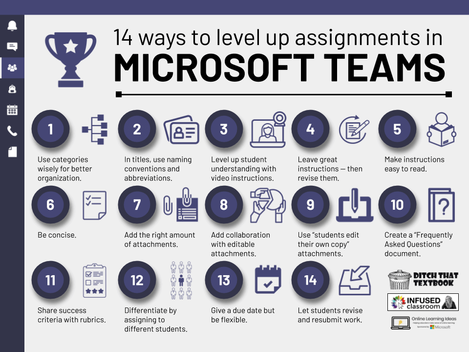
Example infographic above: Recreating a background that looks like the Microsoft Teams app
LOTS of tools out there will let you create great infographics. Thankfully, most are free -- and you probably already have access to several of them! Here are some of my favorites ...
Google Drawings
One of my favorite creation tools is Google Drawings. It's like a digital posterboard (or sheet of paper). You can add text, images, lines and shapes to it. Because it's so simple, the learning curve isn't huge.
Find Google Drawings by clicking the "New" button in Google Drive, using the "More ..." button and choosing "Google Drawings." Or, go to drawings.google.com.
(Note: Currently, Google does not offer a Google Drawings iPad app. However, you can create infographics like these by using Google Slides. Just create the infographic on one slide.)

Google Slides
Google Slides is like a cousin to Google Drawings. Google Drawings has almost all of the same buttons and the menu options as Google Slides. Slides just lets you have multiple slides. Drawings is made for creating just one image. Use Google Slides if you're familiar with it or if you want to do something with multiple pages. The benefit of Google Drawings is eliminating all the extra buttons and menu options for multiple slides. I like Drawings because the user interface is much simpler.
PowerPoint
If you're a Microsoft school -- or if you have easy access to PowerPoint -- this may be even better than Google Slides. PowerPoint has all the same features as Slides and Drawings. But it has a built-in icon library. The design of the icons looks similar, so if you use lots of them, it'll have a consistent feel.
Canva
Canva (canva.com) gets outside the Google/Microsoft productivity suites (although you can log in to Canva with a Google account). Its free version is pretty good. It has some free design elements you can use. Plus, you can upload your own images and icons from other sources.
Honorable mention: These other design tools are good and could help your students make infographics:
- Piktochart (piktochart.com): Drag and drop images and text in a web browser.
- Visme (visme.co): Choose from customizable icons, slide layouts, and more.

A step by step process for making infographics
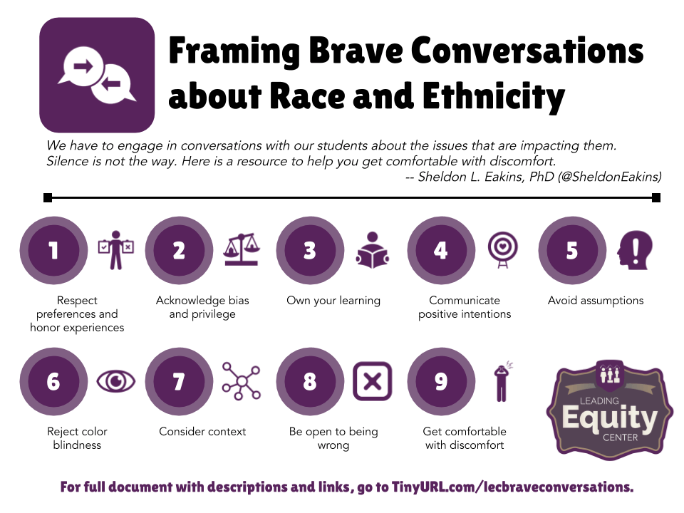
Example infographic above: Representing big ideas with carefully chosen icons
Creating a great infographic takes a little foresight and planning. But a lot of it depends on adjusting on the fly to make everything fit.

1. Make a plan.
Get a general idea of what goes in your infographic. When I plan an infographic, I think about the main goal for it and write a title. I'll make a list of things that need to be included in it. I'll also think about what visuals the reader will need to fully understand.

2. Create your file.
Open your tool of choice and create a new image file. Think about where someone might see your infographic. This can guide the orientation -- portrait or landscape -- and the dimensions of your infographic. Will it be seen on a laptop or Chromebook? (Landscape.) On a mobile device? (Portrait.) Is it going on a website? (Either.) In a research paper? (Either.) Will it be printed? (Either.)

3. Create the title.
This is always my first step when I start creating. I make the title, add a subtitle if I need it (or if I have extra space), and pick out an image to support it. Many times, I'll put it full width across the top of the infographic. Sometimes, I'll put it in a box and put it in the middle of the infographic or even in the top right. You want the title to be big enough to catch the reader's attention but small enough that you have lots of space to provide lots of details in the infographic. I like doing the title first because it lets me see how much space I have left for the rest of the infographic.

4. Create the first image/text item.
I'm a big fan of numbered infographics. This type is the most common infographic I create. I'll make the first item, which is often a number, an icon, and some text. These three items make up a module that I'll repeat over and over again, just changing the number/icon/text each time. As I create the first one, I envision how others will fit on the page. Will I do rows of three? Four? Five? How many rows will fit on the page? Do I have enough content, steps, ideas to fill that many? All of that will play into how big I make that first module and, of course, I can change it at any point.
You don't have to reuse the same "module" (number, icon, text) each time, though! Your modules can vary and be different each time. You can add a quotation, a statistic, an important fact, an image, etc. Some infographics succeed because they're consistent throughout. Others provide variety and contrast to appeal to the eye.

5. Add images and text.
These are what I called "modules" above (number, icon, text). If you're making a numbered infographic, duplicate one of those modules by highlighting all three parts (either shift+click each item or click and drag to highlight). Then use the Ctrl + D keyboard shortcut (Cmd + D on a Mac). That will duplicate everything you highlighted. I'll duplicate a "module" (number, icon, text) and place it next to the first one. Then I'll highlight the two modules and duplicate them so I have four. Then I'll highlight the four and duplicate to make eight. When you duplicate large groups like that, it speeds up the process AND keeps the spacing consistent between modules.
Important point: Spacing between items in your infographics is key. You want to have plenty of "white space" between everything so it doesn't feel too crammed together. That space gives the eye some resting space and keeps your reader from feeling overwhelmed.

6. Fill the page and finish everything.
If you're doing a numbered infographic and just got done duplicating lots of those "modules" (number, icon, text), this is where you change all of the numbers, replace icons, and add text.
Google Slides/Drawings tip: If you've duplicated your modules on the page, you probably have the same icon over and over on the page. The easiest and fastest way to change those icons isn't to insert new images. Instead, click on the icon you want to change. Find "Change image" in the icon bar and click it. This will update the image in the existing image box, which keeps the original sizing and spacing so you don't have to arrange it again.
If you're varying all of the items on your infographic, you'll slowly fill your page with different items.

7. Wrap up and make the design sparkle.
Take a good look at your infographic as a whole. Do parts of it seem too crowded? Too spaced out? Is everything consistent and even? Is the title big enough to draw the viewer's attention?
Check your color usage. For me, one or two main colors throughout give the infographic life and make the design feel like it fits.
Check your font usage. Do you stick to one or two main fonts? I almost always use the same font with the same size for all of the text of the infographic. I'll use a different font for a title sometimes, but I rarely use more than two fonts. Make sure that your text is legible by choosing a readable font and making your text big enough. I usually make text between 10 and 12 points.
Check back over your text to make sure there are no errors and that all of it makes sense.

8. Turn in and share your infographic.
When students finish their infographics, they can turn them in to complete the assignment. If they're using Google Slides or Google Drawings, they should be able to attach their completed infographics directly through Google Classroom. They can always go to File > Download as ... and download it as an image file to turn in, too. This option works well for other learning management systems (LMS) like Canvas and Schoology.
If students create something to be proud of, they should be able to share with an audience greater than just their teacher! Link to student infographics in Classroom or your LMS so others can see. Download the images and put them in a slide presentation to share with others. Post them on social media or a class website. Print them out. Let others see them!
And here's a quick screencast video I did to show the infographic in progress and to show you some things you can do to make them look great ...

Tips and tricks to make the process easier
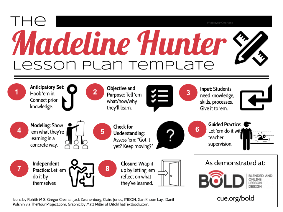
Example infographic above: Summarizing a step by step process with text and icons
You can follow some of the tips I've shared above, like using the "replace image" option in the icon bar and using Ctrl + D to duplicate several elements at once. In addition, try some of these ...
Tip #1: Find great visuals online.
Don't just rely on Google Images for your visuals. They can be copyright protected, so you may end up using someone's work without permission. Try any of these image sources below ...
- The Noun Project (thenounproject.com) -- This one is my absolute favorite and my go-to icon source. You can download and use their icons for free if you give attribution to the icon artist. (When you download an icon, it shows you how to do it. I'll usually crop that text out of the icon and add it in a line of text at the bottom of my infographic.)
- Flat Icon (flaticon.com) -- Another great, free source of millions of downloadable icons.
- Creative Commons images (search.creativecommons.org) -- This will search several huge databases of images that are licensed Creative Commons (i.e. not copyright, all rights reserved). Be sure to give attribution as they instruct.
- Pixabay (pixabay.com) -- A huge database of Creative Commons/public domain images. (i.e. Images we have the rights to use in our work.) Note that this site isn't always available through school Internet filters and some images may not be school appropriate.
- More -- There are lots of other sources of images in this post: How to get and use free images the right way in class.
Tip #2: Use keyboard shortcuts to save time.
I'm a big fan of keyboard shortcuts. They make us more efficient little by little. When you use these enough, they'll become second nature and you won't remember what you did without them!
- Resize text: Control+Shift+comma to make text smaller and Control+Shift+period to make text bigger. Hit the shortcut repeatedly to resize point by point.
- Zoom: Control+Alt++ (plus) to zoom in and Control+Alt+- (minus) to zoom out. This is especially important when you have a large board with lots of details.
- Send to front/back: Control+Shift+down arrow to send to back and Control+Shift+up arrow to bring to front. This makes rearranging the order of items on the page easy. If something is stuck behind something else, use this shortcut.
Tip #3: Find great colors.
Using vivid colors that match the feel you want your infographic to have is crucial. Material UI (materialui.com/colors) is a great resource to do this. Find a color you love there. Click it to copy the hex code of that color. Then, when you go to change the color of text, a border, or a shape, click "custom" and enter the hex code to get that color. Thanks to Tony Vincent of LearningInHand.com for this tip!

Some infographics templates to assign to students
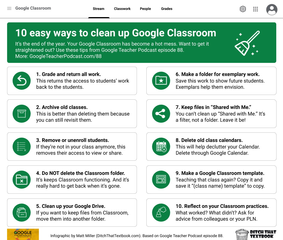
Example infographic above: Recreating design elements from an app to make the infographic feel like it
Creating infographics from scratch can take a lot of time. It can be hard to be creative and start when you have a blank canvas staring you in the face.
One of the struggles with student-created infographics is the time it takes for students to find icons and other graphical elements. What if we could eliminate lots of that time, getting students to work showing what they know even faster?
That's why I created these infographics templates. The examples below are in Google Slides (although you can go to File > Download as ... to get them in PowerPoint files).
I created a blank slide where students can make an infographic. Then, I sprinkled lots of helpful icons, lines, arrows, and text boxes around the outsides of them. Students can just drag and drop any of these items onto the infographic. (Note: I encourage that they instead click an item and use Ctrl + D to duplicate that item, leaving the original around the outside in case they want to use it again.)
Click any of the templates below to make a copy of them. Make any changes and adjustments you'd like to your copy. Then attach them to an assignment in Google Classroom or your learning management system. Students create their drag and drop infographics and submit them to you!
The Great Big Icon Board — A massive 20″ x 10″ board with plenty of space for all your students’ ideas.
The Sequential Icon Board — A long, narrow board broken up into sections to show sequence.
The Treasure Map Icon Board — A fun pirate-themed board to show sequence as you follow the map.
The Art Gallery Icon Board — A simple board with four picture frames to group similar ideas.
The Math Icon Board — A simple board, created by Kimberly Wassmuth and shared on her blog, with icons to show thinking in math and science classes.
Some suggestions to make the most of these templates:
- Add whatever you think students are likely to want to use (i.e. images, diagrams, even text boxes pre-filled with sentence stems, etc.). Just leave it in the space around the board.
Want to create some immovable text or images? Create a background image with all the parts you don’t want students moving around. Use Google Drawings or Slides to do it. There are instructions in this post. - Resize the board to dimensions that best suit the activity. You don’t have to stick to standard-sized slides or letter-sized paper! If you’re not going to print them or present them on a projector, you’re free to modify your boards as you’d like. Just go to File > Page setup … and choose “Custom” from the dropdown menu. Resize it using inches, centimeters, pixels, etc.
- Have students use lines and boxes for structure. These can help students organize their material and make it their own. Also, help them to remember “white space” — unused space around the elements. It keeps a board from looking too overwhelming.
- Don’t forget different line types. Use the curved line and click to create “bend points” when drawing it. (See the wavy arrow lines in my examples above.) A scribble line lets you draw free-hand, and a poly line lets you connect straight lines together into a shape.
- Use the Image > Camera option to add a personal touch. Students love to see themselves in their work! Find ways to incorporate webcam photos of themselves to add an additional dimension to their activities.
How have you used infographics? Do you have another source of images or icons you use? Share any ideas or tips in a comment below!
For notifications of new Ditch That Textbook content and helpful links:
Are you looking for quality, meaningful professional learning that both equips and inspires teachers?
Matt provides in-person and virtual keynotes, workshops and breakout sessions that equip, inspire and encourage teachers to create change in their classrooms. Teachers leave with loads of resources. They participate. They laugh. They see tech use and teaching in a new light. Click the link below to contact us and learn how you can bring Matt to your school or district!
Is Matt presenting near you soon? Check out his upcoming live events!


thanks for this good information regarding nfographics
[…] Create eye-popping infographics with Google Drawings: Infographics are visually stimulating and force us to summarize well. These brain-friendly student creations can be a great change of pace for essays and research papers. […]
This is fabulous! Although I am not surprised because everything from Ditch That Textbook is amazing:). This has been my “go-to” source for years, and I love that there is always something new to learn!
Thank you for such a detailed article!
An infographic is a great way to present information. But I’ve never been good at creating really eye-catching infographics for my students. Now I have time to practice.
Hi! I came across this page in a desperate act to look for something for my students to do for their 20% project, and I just want to say a big THANK YOU for sharing this! This is fantastic. I can’t wait to do this with my students and see what they come up with. Hats off to Ditch That Textbook all the way from Malaysia!
I would recommend slides in lieu of drawings because of all the icon addons you have access to
You’re killing it, Matt! Thank you SO MUCH for all of the fantastic resources you share!
[…] Read: Creating eye-popping infographics with Google Drawings […]
[…] great source for teaching with tech strategies – Ditchthattextbook website, includes post on ideas and tools for […]
[…] Creating eye-popping infographics with Google Drawings | Ditch That Textbook […]
God this hear someone else has discovered how powerful Google Drawings can be, you should see some of the examples our Grade 5 students made last year, featured here:
http://doverdlc.blogspot.sg/2015/12/transforming-postersinfographics.html
Love these ideas! Could I have your permission to make an editable copy of this Google drawing so that I can translate it to Spanish? I want to make a poster of it for my dual language classroom.
Sure! Use this link and go to File – Make a copy … to copy it into your Drive.
https://docs.google.com/drawings/d/12hnEyw3PHg7lRkJghKeoHvR0Mbs9SrvI375gJjECy6A/edit?usp=sharing
Thank you so much. I will share the translated drawing with you when I’m finished.
[…] Creating eye-popping infographics with Google Drawings | Ditch That Textbook […]
Matt, this is great! Thanks for sharing it. I was just showing a science teacher how he could use Google Drawings for “digital posters” like this. I sent him a link to this post.
I also just wrote this post about seeing learning experiences as stories. I have a template for it in Google Drawings: http://www.teachinglikeanartist.com/2016/11/learning-as-story-google-drawings.html
[…] Creating eye-popping infographics with Google Drawings #edtech #gsuiteedu #infographics @jmattmiller ditchthattextbook.com/2016/11/28/cre… […]
Thanks for yet another awesome post. I decided to put your info to work in a practice infographic based on your information: https://docs.google.com/drawings/d/18lPYDTxUJA8kC2gHETCMWN841y1hSjJBx6daOVTdakk/edit?usp=sharing
Wow, nicely done Kathy!